
Dovetail fabrications
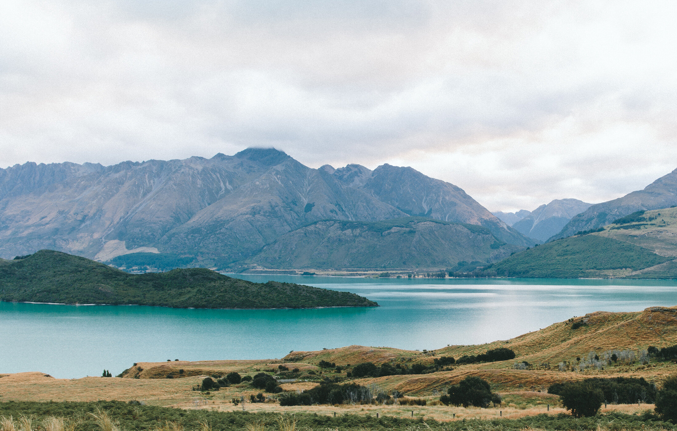
Nosara, Costa Rica // New York, New York
Scope Of Work
Brand and Identity Design & Website Design
Objective
Renegade Collective partnered with John Robinson, owner of Dovetail Fabrications to refresh and elevate his brand presence, bringing a modern, cohesive identity to their high-end custom fabrication business.
aesthetic
*
aesthetic *
Dovetail’s aesthetic is a blend of modern minimalism and industrial craftsmanship: clean, precise, and quietly bold. It draws inspiration from architectural forms, natural materials, and the elegance of functional design. Every visual touchpoint reflects the core of his work: timeless design rooted in integrity and attention to detail.
branding
branding
color palette
Dovetail’s color palette is bold and industrial, anchored by a vibrant yellow inspired by caution tape—a visual nod to construction, creativity, and hands-on craftsmanship.
typography
Dovetail’s typography is bold, industrial and timeless. It’s anchored by Helvetica Neue Bold, a typeface deeply connected to the visual language of New York City. Helvetica has long been a symbol of urban clarity and cultural edge that is iconically enduring.
Parsley introduces a handwritten element that adds texture and personality..bringing in a raw, human touch that echoes Dovetail’s handcrafted, process driven approach to fabrication.
Logo Design
The Dovetail Fabrications logo blends industrial grit with creative precision, that is perfectly capturing the intersection of artistry and architecture. The torn edge evokes the raw edge of material in process..like steel before it’s polished, or paper freshly ripped from a sketchpad. It speaks to the hands-on, tactile nature of Dovetail’s work, grounding the brand in real-world fabrication, craftsmanship, and material authenticity.
Website Design
Dovetail’s website is a bold visual experience: raw, refined, and unapologetically industrial. Built to mirror the brand’s fusion of art, fabrication, and culture, the design feels like stepping into a digital workshop where creativity meets precision.
The layout is minimal yet high-impact, with large, bold type and striking black-and-yellow contrast that echoes caution tape, an intentional nod to the brand’s connection to construction, culture, and real-world materials.